 |
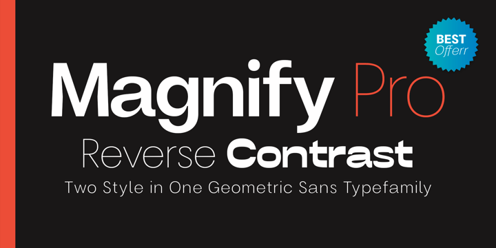
| Magnify PRO Font Family was designed by Faldy Kudo, and published by XdCreative. Magnify PRO contains 20 styles and family package options. |
Download Now
Server 1Download Now
Server 2Download Now
Server 3
 |
| Magnify PRO |
 |
| Magnify PRO Font Family was designed by Faldy Kudo, and published by XdCreative. Magnify PRO contains 20 styles and family package options. |
 |
| Magnify PRO |
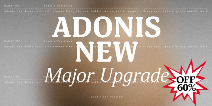 |
Adonis New is a considerate update of the Adonis serif. This dense serif with smooth lines has new, bolder styles, and it supports Greek now. In addition, Natalia Vasilyeva reworked the main styles and made them fresher and more accurate. Adonis New works well in bookset, particularly in fiction and humanities. New version was released by ParaType in 2021.
 |
| Download Adonis New Fonts Family From ParaType |
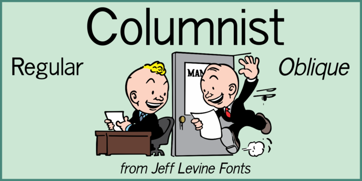
“News Gothic” has been a reliable workhorse of a font since it was created by Morris Fuller Benton and first offered for sale in 1908 by American Type Founders.
A clean, legible design used for text copy, it can also double as a light headline face.
This reinterpretation (named Columnist JNL) is available in both regular and oblique versions.
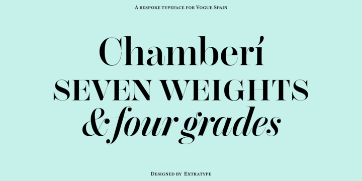
Chamberí is designed to be Vogue España's bestpoke typeface. An ambitious typographic branding project made for one of the most iconic magazine headers of the world, it defines the Spanish edition’s personality through a blending of the functionality of XIX Century Modern Romans (also known as “Scotch" typefaces) and the gestural expressiveness of typographic Baroque. Chamberí is a peculiar combination of the rational and the delicate, the sturdy and the feminine. The family is organised in a broad spectrum of 56 variants in which the transition from the restrained text version to the flamboyant, elegant display is modulated by contrast. The family is organised in seven weights: from Extra Light to Black, plus four contrast grades: Text, Headline, Display and Superdisplay. All this with its own Italics, Small Caps and Old Style Figures, besides the due refinement to resolve any editorial and communicative requirement.
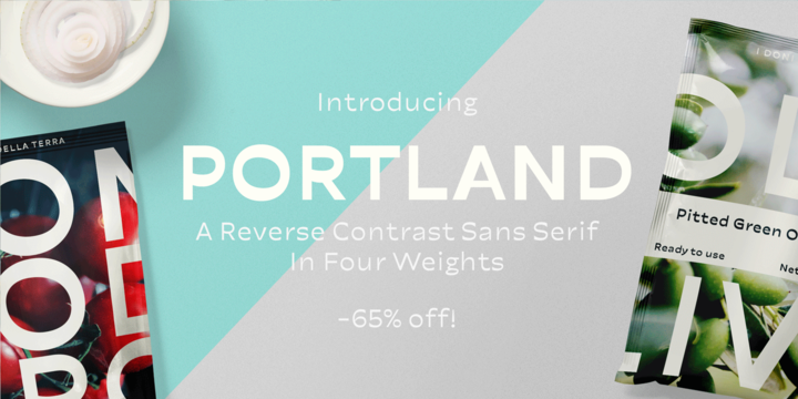 |
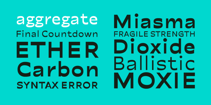
Made you look? There’s a peculiar feel to the letters – achieved by the reversed contrast. Perfectly legible yet there’s something about the characters that makes them stand out. As Viktor Shklovsky once coined, ”Habitualization devours objects” – the everyday world becomes invisible until we are forced to see it otherwise.
The Portland font family is a tool of choice when you want to effortlessly make your designs stand out.
 |
| Download Portland Fonts Family From Fenotype |

©
Lada Kozlova
2014 . Powered by
Blogger
Blogger Templates
.
.