


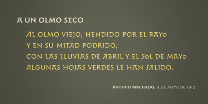
Fresh Orange is a type of font that presents a unique style for every design project such as cartoons, comics, poster designs, and so on.
Fresh Orange has two styles: regular and extrude, which will create a great layered look when combined.
Fresh Orange is a type of font that presents a unique style for every design project such as cartoons, comics, poster designs, and so on.
Fresh Orange has two styles: regular and extrude, which will create a great layered look when combined.
 |
Zuume Soft is a high-impact, condensed sans serif, display font family with a soft touch. A sister to Zuume, this version features round corners for a little bit of a friendly appearance. Coming in multiple weights and italics, its range in thickness give a sharp, technical feel in the lighter weights, while the bold, blacker weights are meant to be tightly spaced and stacked for a visual punch.
A distinct characteristic of this all caps typeface is the notched and extended ink traps meant for both function and aesthetic interest. The strong and sturdy design makes it ideal for eye-catching headlines, branding, packaging, magazines, sports, logos, and more.
Also part of each font file are matching pre-designed catchwords that add texture to your typography. Stylistic alternates and arrow glyphs increase the options available as well.
Zuume Soft has many features:
• Catchword glyphs (PUA-encoded)
• Stylistic alternates
• Arrows
• Fractions, numerators, denominators
• Superscript, subscript
• Slashed zero
With about 600 glyphs, this font has extensive multilingual Latin language support (100+ languages) for Western, Central, and South Eastern European.
 |
| Download Zuume Soft Fonts Family From Adam Ladd |
 |
Serif wide thin lines


Emirose consists of 4 weights: Thin, Light, Regular and Bold, all equipped with many ligatures and alternative letters that look cute and classy. They work very well for your work such as logos, brands, packaging, posters, invitations, headlines, posters, and more.
 |
Hologram is a font inspired by a combination of the future and the past. The intention was to design a font that was most effective when applied to Largely Displayed text like Headings, rather than for smaller extended bodies of text.
There are 3 distinctive styles offered in the Hologram font family. Each style contains over 350+ Glyphs per style with support for up to 26 Languages as well as specialised kerning & spacing.
Designed by KAZER STUDIO
 |
Brillia is a sweet modern calligraphy, soft hand-lettered handwritten font. Fall in love with its authentic feel and use it to create gorgeous wedding invitations, beautiful stationary art, eye-catching social media posts, and cute greeting cards.


 |
Harri –“stone” in Basque language– is a display font based on the peculiar letter forms used in signs and fascias all over the Basque Country. This idiosyncratic lettering style, very often used as an identity signifier, evolved from ancient inscriptions carved on gravestones which can still be found in the French part of the Basque Country (Behe Nafarroa, Lapurdi and Zuberoa).Harri takes some of its more significant features from those engraved letter forms, but also from the current overemphasized shapes derived from them, while keeping in sight their antecessors: the Romanesque inscriptions and ultimately the Roman Capitals. Gerard Unger once said “the black version of a font is a caricature of the regular”. This may explain how the odd heavy shapes in use in the Basque Country today might have evolved from their engraved roots, which are already an interpretation of Romanesque and Roman letter forms.
This evolution is echoed in Harri through its weights, from the clean formal Roman-inspired light to the extreme expressive Basque-style extra bold.
 |
| Download Harri Fonts Family From Blancoletters |
 |
Frizzy is a classic look vintage style font with a big set of additional characters. Lowercase letters have 4 stylistic sets with different shapes. Uppercase letter has two additional glyphs with upper and lower swashes. All those features can be found in the OpenType panel. Five extra swashes are available in the glyphs panel. When combining all of this features, you can create an interesting and unique lettering compositions.
Thank you and have a nice day!
 |
The result of reducing elements of letterforms to only its necessity in lowercase is mostly influenced by the ideal of Aerodynamics. The true intention behind the design of Cobe is to construct a fluid typeface while maintaining a strong structure of uppercase that possessed distict forms, shapes and corners, resulting in an eye-pleasing texture when forming a sentence.
Cobe comes in 9 consecutive weights with italics and standard features.
 |
| Download Cobe Fonts Family From Stawix |


For anyone who prefers to stand out from the crowd, than to go with the flow!
Arpona is a typeface with small wedge serifs and a strong character, ideal for corporate design and all projects characterized by a sense of individualism – for example art, fashion, food, beverage and lifestyle topics.
Arpona is inspired by roman letters carved in stone but otherwise difficult to categorize. It is neither a pure serif nor a sans but rather a symbiosis of different design concepts. Because of its display qualities, Arpona is a good choice for packaging, advertising and editorial design and is well readable even in running text on screen.
The family has nine weights, ranging from Thin to Black plus corresponding italics. Each style includes 590 glyphs supporting all western-, eastern- and central-european languages including four sets of figures and various currency symbols.
For more information visit the microsite: http://floodfonts.com/arpona